Objectives
- Replatform their existing products to a new platform
- Implement a cohesive design system across this (and many other) products

Stay in control for drills, active incidents and reunification by keeping vital teams apprised through a centralized, cloud-based user experience with Emergency Management Suite.
We helped Navigate360 redesign and replatform their web and mobile Emergency Management Suite product.
Navigate360 is one of the largest school safety software providers in the U.S. They were the result of a recent merger between several of the leading players in the space and brought in UX Cabin to help them redesign their entire Emergency Management Suite.


Existing emergency management solutions are outdated, require a lot of many entry, and had difficulty integrating with other software schools relied on.
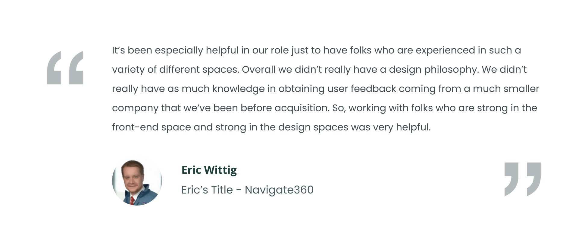
Takeaways
Opportunities

The EMS platform was outdated and we needed to decide if we should rebuild both the mobile and desktop app simultaneously.
We did the following exercises to find out what was most imporant for users and how to successfully rebuild them.
Feature prioritization survey
We put together a holistic survey that included the feature set placed into a KANO model.
Our “Respond” feature was the top feature for the mobile experience whereas “SafetyPlans” came out on top for our Desktop experience.

In addition to learning about which features users wanted and on which device, we also learned which needed the most love from the same survey.
“Safety Plans” were the most requested but also were found to need the most work to be useful. “Maps”, “Respond”, and “Reunification” became fast follows.
This made prioritization clear as Respond on mobile became our top priority to get right as our core feature on the first iteration.
Personas definition
Having an understand for the type of people using our application was essential as we considered the priorities and needs for each individual.

We then set out on our design sprint workshop to define how we might accomplish, prioritize and envision these features coming to life in a product development lifecycle.

We mapped out “how might we’s”, prioritized features, discussed timelines, sketched out solutions, voted on feature ideas and ultimately refined our feature-set for our MVP prototype that we would test with users

Based on the resulting wireframes and flow of the design sprint came a prototype. This was then validated as an MVP and released to the development team.
Before the MVP was even deployed, design began on the next feature decided based on the next most important features requested from the survey and/or business requirements. User testing would be done on each of the features before development handoff.

User testing was done via zoom through a clickable Figma prototype

Prototypes were developed for each feature and iterations were done based on user testing results.
+ 20 hours worth of qualitative feedback and user testing sessions helped us refine our redesign.
UX Cabin created designs to help Navigate360 EMS stand out as the simplest, easiest to use, and most feature rich emergency management platform
Once workflows were validated we completed designs for the app focusing on simplicity and a modern aesthetic to set EMS apart from other, older competitors.

A design system was created from scratch and built to be extensible and used for all future Navigate360 products.
The Design System was created with Brad Frost’s “Atomic Design” philosophy. In this model, the smallest UI elements are referred to as “atoms” (ie, icons, labels) and are assembled together in order to create components referred to as “molecules” (ie, buttons, inputs). Molecules are put together in order to create more complex components called “organisms” (ie, cards).”
Some examples of these design molecules include:

Whether it was building new products or re-platforming old products we needed a scalable design system to accommodate the growing suite of products within Navigate360.

UX Cabin leveraged both live audited user tests and self-directed user tests through Maze to refine the design of Visitor Management.
Moderated user tests
When we needed context beyond just clicks we conducted live users tests of Visitor Management. This allowed us to understand user needs and intent in real time and ensure our designs were solving the right problem.

Unmoderated user tests with Maze
When design questions centered more around making a complex flow simple enough to be understood we leveraged the user testing platform Maze for quick feedback about each of the designs.

User surveys
In addition to interactions with the protoypes we gathered direct feedback about the usability of each flow as well as suggestions for improvement.